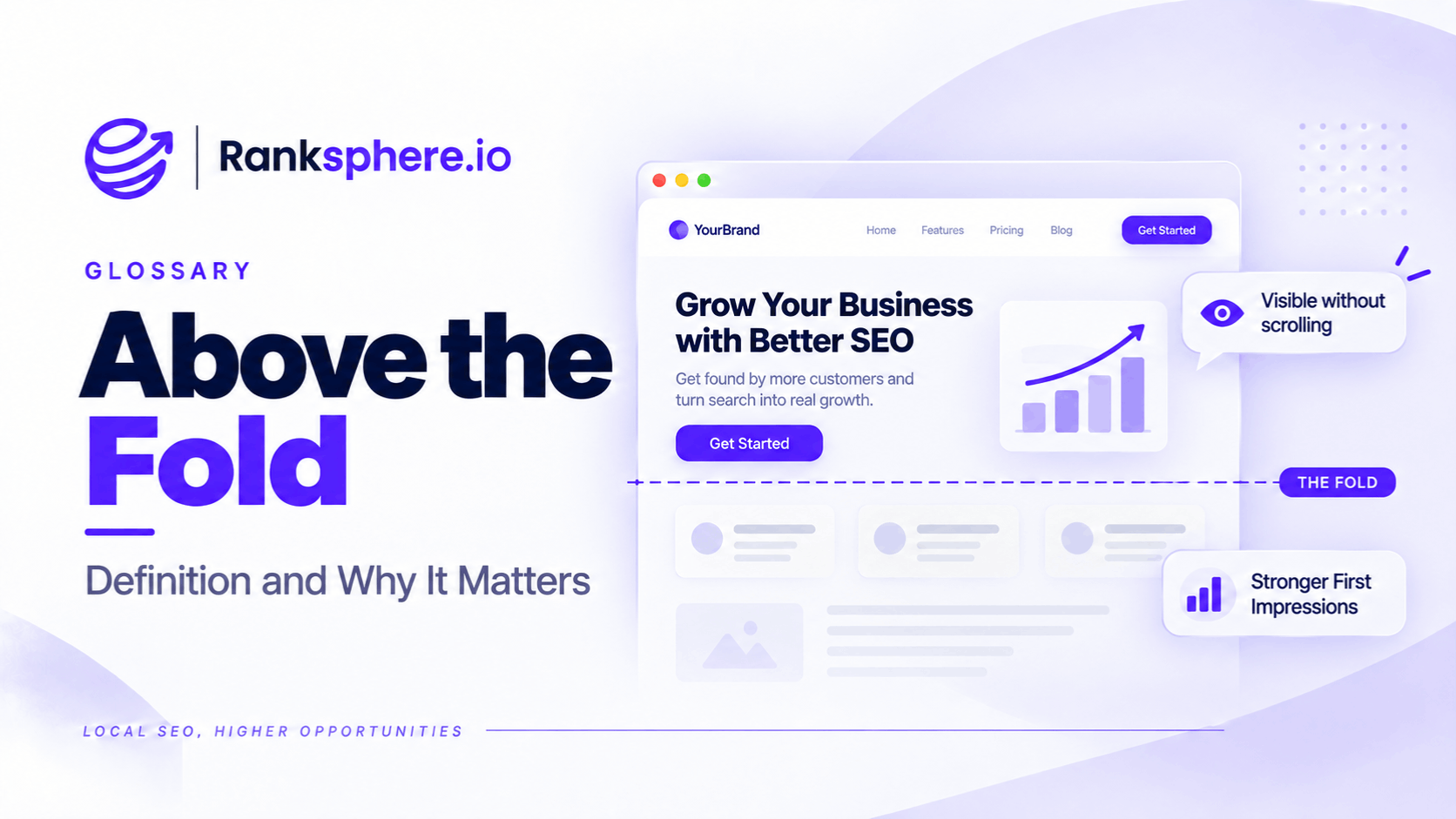
Above the fold refers to the portion of a webpage that visitors can see before scrolling. It usually includes the navigation, main heading, introductory content, and any images or buttons visible when the page first loads.
The term comes from newspapers, where the most important stories traditionally appeared above the physical fold of the paper.
On websites, however, there isn't one fixed fold.
The visible area changes depending on the visitor's device, screen size, browser, and display settings. A page that looks well organised on a desktop computer may show very little useful information on a mobile phone.
For local businesses, this matters because visitors often arrive with a specific question or need.
Someone searching for an emergency plumber may want a phone number immediately. A patient looking for a dentist may want to confirm that the practice offers the treatment they need.
If that information is difficult to find, the visitor may leave without contacting the business.
Above-the-fold content is therefore more than a design consideration. It plays an important role in helping visitors understand a page and take the next step.
Why Is Above-the-Fold Content Important?
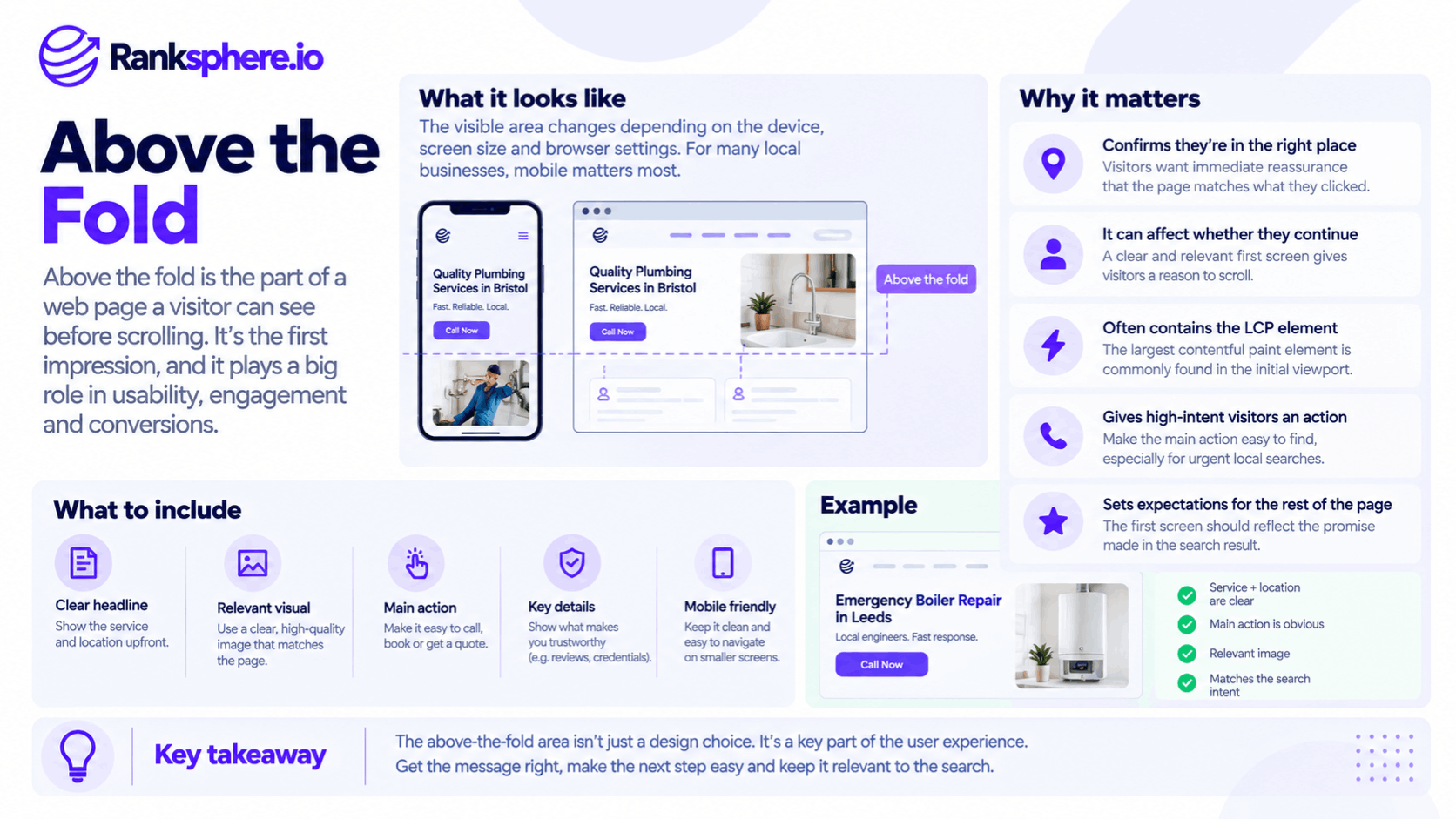
The first visible section of a webpage helps visitors decide whether they've reached the right place.
It also introduces the page's main content and often contains important elements that affect loading performance.
1. It Helps Visitors Understand the Page
When someone clicks a search result, they usually have an expectation about what they'll find.
For example, a person searching for "roof repair in Bristol" expects to reach a page about roof repair services in Bristol.
If the first screen only shows a large photograph and a vague slogan, the visitor may struggle to confirm whether the business offers what they need.
A clear heading and short explanation can provide that confirmation immediately.
For example:
Roof Repairs in Bristol
Roof leak repairs, damaged tiles, and guttering services for homes across Bristol.
This tells visitors what the business does and where it operates.
They can then decide whether to continue reading or contact the company.
2. It Makes Important Actions Easier to Find
For many local business websites, the goal isn't simply to encourage visitors to read more pages.
It's to help them contact the business, request a quote, or book an appointment.
The first screen should make the next step easy to identify.
Depending on the business, this might mean showing:
- A tap-to-call button
- A booking button
- A request-a-quote link
- A contact form button
- A link to available appointments
For example, someone dealing with a burst pipe may prefer to call a plumber immediately rather than read several paragraphs about the company's history.
A visible phone button removes unnecessary steps from that process.
However, the most useful action depends on the visitor's intent. A person researching a non-urgent service may want to understand their options before making contact.
3. It Can Affect Largest Contentful Paint
Above-the-fold content often includes the largest visible element on a page.
That element may be a hero image, prominent heading, or another large content block.
Google's Largest Contentful Paint (LCP) metric measures when the largest qualifying visible content element finishes rendering.
LCP is one of Google's Core Web Vitals.
If a large hero image takes several seconds to load, it may delay LCP.
However, the largest element isn't always an image, and its position alone doesn't determine performance.
Image size, loading priority, server response time, and rendering behaviour can all affect the result.
4. It Sets Expectations for the Rest of the Page
The first screen doesn't need to contain every answer.
It should make the page's purpose clear and help visitors understand what they can find by continuing.
For example, a dental implants page might introduce the treatment and provide a short explanation before presenting sections covering:
- Treatment suitability
- Costs
- Procedure steps
- Recovery
- Frequently asked questions
This gives visitors enough context to decide whether to scroll further.
What Should Appear Above the Fold on a Local Business Website?
The best above-the-fold content depends on the page's purpose.
However, most local service pages benefit from a few essential elements.
A Clear Heading Explaining the Service
The main heading should quickly tell visitors what the page is about.
For example:
Emergency Plumbing Services in Manchester
This is more informative than a generic heading such as "We're Here When You Need Us."
The second phrase could work as supporting copy, but it doesn't clearly identify the service.
For local service pages, using the service name and relevant location naturally in the heading can help visitors confirm they've found the right business.
However, avoid forcing multiple city names or keyword variations into the first screen.
A Short Explanation of What the Business Offers
A brief supporting sentence can explain the services available or who the business helps.
For example:
We repair leaking pipes, blocked drains, and other urgent plumbing problems across Manchester.
This gives visitors useful information without requiring them to scroll.
The explanation doesn't need to include every service.
More detailed information can appear further down the page.
A Visible Call to Action
The next step should be easy to find.
For a plumbing company, that may be a phone number.
For a dental practice, it may be an appointment booking button.
For a roofing contractor, it could be a request-a-quote button.
Make the action clear and appropriate for the page.
For example:
Call for Plumbing Assistance
Book an Appointment
Request a Free Quote
Only use claims such as "free," "24-hour," or "same-day" when the business genuinely offers those services.
On mobile devices, telephone numbers should be tappable so visitors can open their phone's calling interface directly.
A Relevant Reason to Choose the Business
The first screen may also include a short piece of information that helps visitors assess the business.
For example:
- A genuine customer rating
- A relevant professional registration
- Service availability
- Experience with a particular treatment or service
- A clearly stated service guarantee
These details can help establish credibility.
However, they should be accurate and verifiable.
Avoid filling the first screen with several badges, awards, and promotional claims that make the page harder to understand.
The priority is helping visitors identify the service and their next step.
What Should You Avoid Above the Fold?
Some website elements take up considerable space without helping visitors understand the page.
This is particularly noticeable on mobile devices.
Oversized Hero Images
Large hero images are common on local business websites.
They can help communicate the service visually, but they shouldn't prevent important information from appearing.
For example, a roofing website might open with a full-screen photograph of a completed roof.
If the image pushes the service heading and contact button below the fold, visitors may need to scroll before discovering what the business offers.
A more useful design might combine a smaller image with a clear heading and visible contact option.
The image should support the content rather than replace it.
Generic Marketing Slogans
Statements such as "Quality You Can Trust" or "Excellence in Everything We Do" may sound appealing, but they don't tell visitors much about the service.
A customer searching for roof repairs wants to know whether the company handles roof repairs.
Use clear, specific language before broad promotional statements.
A slogan can still appear as supporting text if it adds something useful.
Large Navigation Menus
Navigation is important, but it shouldn't occupy most of the first screen on mobile.
Oversized headers, excessive menu spacing, and large logos can leave little room for the page's main content.
Keep mobile navigation clear and proportionate.
Visitors should be able to find the menu without it dominating the screen.
Carousels and Image Sliders
Some websites use rotating hero banners to display several messages.
However, sliders can create usability and performance problems when poorly implemented.
For example, automatic transitions may distract visitors or move important information before they finish reading it.
Large carousel images can also increase the resources the page needs to load.
That doesn't mean every carousel is harmful.
But for many local service pages, a single clear heading, relevant image, and call to action may be more effective.
Cookie Banners Covering Important Content
Cookie consent banners can occupy a large portion of a mobile screen.
If a banner covers the heading, phone number, or booking button, visitors may struggle to use the page.
For example, a poorly designed consent overlay might cover nearly all the visible content on a small phone.
Businesses should review how consent banners appear on actual mobile devices.
However, improving the design shouldn't involve hiding required information or making consent choices difficult to understand.
The banner still needs to meet applicable privacy and consent requirements.
Above the Fold and Mobile-First Indexing
Mobile usability deserves particular attention because the visible area on a phone is much smaller than on a typical desktop monitor.
Google primarily uses the mobile version of a website's content for indexing, as explained in mobile-first indexing.
However, this doesn't mean Google requires particular content to appear above the fold on mobile.
Mobile-first indexing concerns which version of the website Google uses for indexing.
Above-the-fold design concerns what visitors see before scrolling.
The concepts are related, but they aren't the same.
Why Desktop Designs Can Fail on Mobile
A homepage may look clear on desktop because there is enough space for:
- A navigation menu
- A heading
- Supporting text
- An image
- A contact button
On mobile, those elements may stack vertically.
A large logo, tall navigation header, and oversized hero image can push the contact button far down the page.
This makes the first screen less useful.
When reviewing mobile layouts, check what visitors actually see rather than assuming the desktop design will work.
Test Different Mobile Screen Sizes
There is no universal mobile fold.
The visible area varies according to:
- Screen dimensions
- Device orientation
- Browser interface
- Text scaling
- Accessibility settings
- Website layout
A design that works on one smartphone may appear differently on another.
Testing several screen sizes helps identify layouts where important information becomes difficult to find.
Do Visitors Scroll Below the Fold?
Yes. Visitors regularly scroll through webpages when the content gives them a reason to continue.
The idea that nobody scrolls is outdated.
Long articles, service pages, and product descriptions can all work well when they are organised clearly.
The problem isn't having useful content below the fold.
It's failing to show visitors that the page contains the information they need.
Don't Try to Fit Everything on the First Screen
Cramming every service detail, review, image, and contact option into the first screen usually makes the design harder to use.
Instead, prioritise the most important information.
For a local service page, that may be:
- What the business offers
- Where it operates
- How to make contact
- A short reason to choose it
Other details can follow in a logical order.
Give Visitors a Reason to Keep Reading
The first section should introduce the topic and lead naturally into the rest of the page.
For example, a physiotherapy page might begin with a clear explanation of the treatment and a booking option.
Further down, it could explain:
- Conditions treated
- What happens during an appointment
- Treatment costs
- Practitioner qualifications
- Frequently asked questions
Visitors who need more information can continue reading.
Those ready to book can act immediately.
Avoid False Bottoms
A false bottom happens when a page appears to end even though more content exists below.
For example, a full-screen hero section may fill the entire viewport with no visual indication that additional content follows.
Some visitors may assume there's nothing else to see.
A layout can avoid this by making the transition to the next section clearer.
The goal isn't to force scrolling.
It's to help people understand that more relevant information is available.
How Above-the-Fold Content Affects Conversion Rates
Above-the-fold content can influence how easily visitors complete important actions.
For local businesses, those actions may include:
- Calling
- Booking an appointment
- Requesting a quote
- Submitting an enquiry
- Finding directions
A page that clearly presents the next step can reduce unnecessary friction.
For example, if a visitor urgently needs a plumber, a visible phone button may be more useful than a long introduction about the company's experience.
However, placing a button above the fold doesn't automatically improve the conversion rate.
The outcome depends on the visitor's intent, page content, business offering, trust, and overall usability.
Match the First Screen to Search Intent
Different search queries suggest different needs.
For example:
Emergency plumber near me
The visitor may want immediate contact information and confirmation of availability.
How much does a boiler replacement cost?
The visitor may want pricing information before contacting anyone.
Dental implants in Birmingham
The visitor may want treatment details, practitioner information, costs, and booking options.
The first screen should reflect what someone searching for that topic is most likely trying to accomplish.
This makes the page more useful than applying the same generic hero section to every service.
Make Contact Options Easy to Use
On mobile devices, a visible, tappable phone number can help visitors contact a business quickly.
For appointment-based businesses, a clear booking button may be more appropriate.
For services requiring a detailed quotation, a request form may work better.
The important point is to avoid unnecessary steps between the visitor and the action they want to take.
Above the Fold and Page Speed
The first visible section of a page can also affect perceived loading performance.
If the main heading, image, or call to action takes too long to appear, visitors may experience the page as slow.
Optimise the Largest Visible Element
The largest content element above the fold may determine LCP.
For example, a full-width hero image may be the page's LCP element.
To improve loading performance:
- Use an appropriately sized image.
- Compress large image files.
- Consider modern image formats.
- Make important resources discoverable early.
- Reserve appropriate image dimensions.
- Avoid unnecessary rendering delays.
The correct changes depend on the page and its measured performance.
Avoid Lazy Loading Important Above-the-Fold Images
Lazy loading delays certain resources until they are likely to be needed.
This is useful for images further down the page.
However, lazy loading a hero image that is immediately visible can delay its request and worsen LCP.
Important above-the-fold images should generally load without lazy-loading deferral.
Depending on the page, appropriate resource prioritisation may also help.
Check Mobile Performance
Test the page under realistic mobile conditions.
A website may load quickly on a desktop with a strong connection but perform differently on mobile.
Review both laboratory tests and available real-user performance data.
Ranksphere's website audit tool helps identify website performance and technical issues that may affect the loading experience.
Common Above-the-Fold Mistakes
Several design decisions can make the first visible section of a webpage less useful.
- Designing mainly for desktop. Important information may be pushed below the fold on mobile.
- Using a large image without useful context. Visitors may struggle to identify the service.
- Hiding the main contact option. Phone numbers and booking buttons can be difficult to find.
- Letting navigation occupy too much space. Oversized mobile headers reduce the space available for useful content.
- Using intrusive consent overlays. Large banners may cover important information.
- Relying on generic slogans. Promotional statements don't always explain what the business offers.
- Using unnecessary carousels. Sliders can complicate navigation and loading performance.
- Lazy loading important hero images. This can delay the largest visible content element.
- Trying to fit the entire page above the fold. Overcrowded layouts can be harder to understand.
Above-the-Fold Best Practices
For local business websites, focus on making the first screen clear and useful.
- Test the page on real mobile devices.
- Use a heading that identifies the service.
- Include the relevant location naturally where appropriate.
- Provide a clear next step.
- Make important contact options easy to find and use.
- Include relevant trust information without overcrowding the layout.
- Avoid oversized images that push useful content out of view.
- Keep navigation simple on mobile.
- Check how cookie consent banners affect the visible area.
- Optimise the largest visible content element.
- Avoid lazy loading important above-the-fold images.
- Give visitors a clear reason to continue scrolling.
- Review page performance and conversion data after making changes.
The objective isn't to fill the first screen with as much information as possible.
It's to help visitors quickly understand the page and find the next step that matters to them.
Example of Improving Above-the-Fold Content
Consider a hypothetical plumbing company called Aldermoor Plumbing.
The company offers emergency plumbing services, but its mobile service page isn't designed around urgent enquiries.
When someone opens the page, the first screen contains:
- A large photograph of a company van
- A generic slogan
- A tall navigation header
- A cookie consent banner
The phone number is hidden inside the mobile navigation menu.
Someone dealing with a burst pipe must find the menu, open it, and locate the number before they can call.
What the Agency Changes
The agency reviews the page and identifies several opportunities to make the first screen more useful.
It replaces the generic slogan with a clear heading:
Emergency Plumbing Services Across the County
A short supporting sentence explains the service area and availability, using only information the company can verify.
A prominent tap-to-call button appears directly beneath the heading.
The van photograph is moved lower on the page, where it can still support the business's credibility without occupying most of the initial viewport.
The navigation is simplified, and the cookie banner is redesigned to take up less space while maintaining appropriate consent controls.
How the Agency Measures the Results
The agency compares performance before and after the changes.
It reviews:
- Mobile contact button clicks
- Tracked phone calls, where available
- Enquiry submissions
- Mobile usability
- Relevant Core Web Vitals
To understand the impact, the team also considers changes in traffic sources, search demand, and other factors that may influence enquiries.
The revised layout makes the main contact option easier to find, but the agency doesn't assume that every additional click represents a completed call.
Example Shows
“The original page placed visual design ahead of the information visitors needed.
The updated version gives people a clear explanation of the service and an obvious way to make contact.
The improvement isn't about forcing every detail above the fold.
It's about making the first screen useful.
Above-the-fold content should quickly confirm that visitors are in the right place and help them take the next step.
For local businesses, that often means prioritising the service, location, and contact option while leaving more detailed information further down the page.”
See Also
- Core Web Vitals — Measuring loading performance, responsiveness, and visual stability.
- Mobile-First Indexing — Understanding Google's use of mobile website content for indexing.
- Conversion Rate — Measuring how often visitors complete important actions.
- Lazy Loading — Delaying resources that aren't needed immediately.
- Service Page — Presenting service information and guiding visitors toward enquiries.
- Page Speed — Understanding the factors affecting website loading performance.