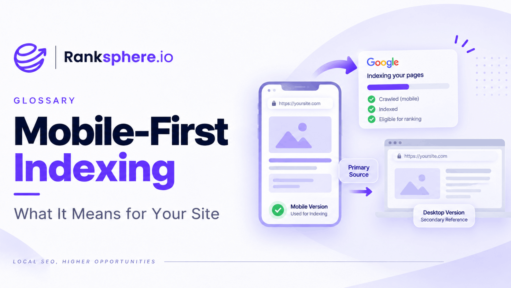
Mobile-first indexing means Google primarily uses the mobile version of a webpage's content for indexing and ranking.
In other words, when Google evaluates what a page contains, it looks primarily at the version available to its smartphone crawler rather than treating the desktop version as the main source.
Google began moving websites to mobile-first indexing years ago and announced that the rollout was complete in October 2023. In July 2024, Google also moved the remaining small group of sites still being crawled with desktop Googlebot to smartphone crawling for Search.
For website owners, the practical message is simple:
the important content and functionality available on desktop should also be available on mobile.
What mobile-first indexing actually means
Mobile-first indexing is sometimes reduced to:
“Make sure your website looks good on a phone.”
That matters, but it is only part of the picture.
The more important issue is what Google can actually access and understand from the mobile version of the page.
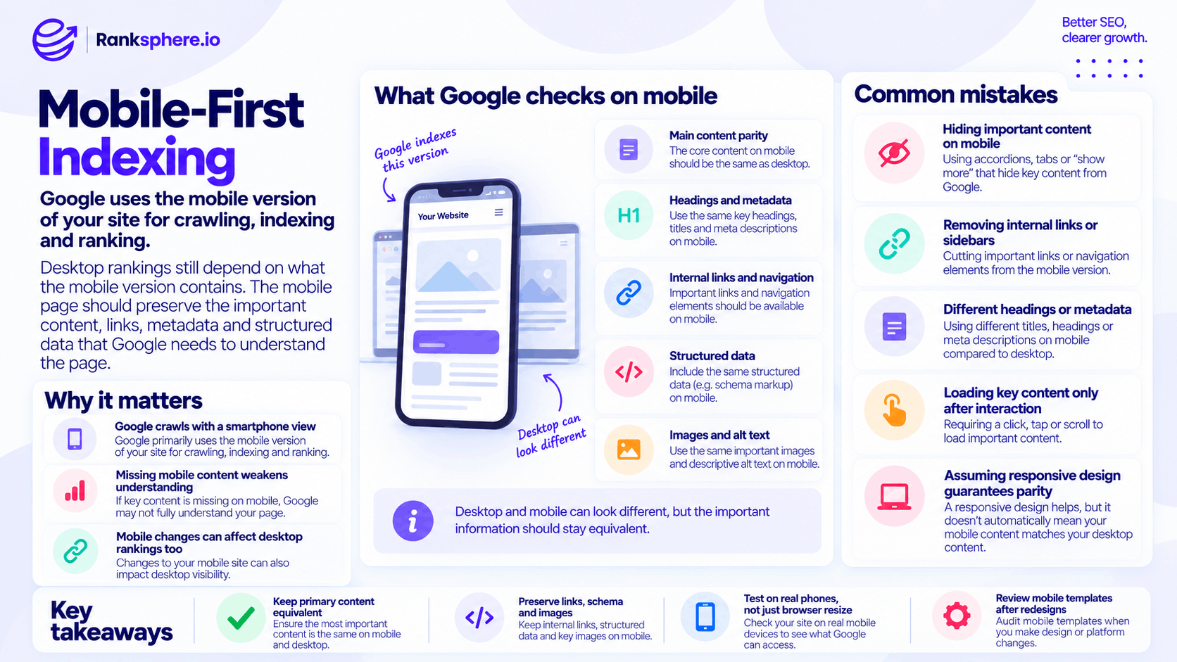
Google states that it uses the mobile version of a site's content for indexing and ranking. It also recommends keeping the primary content equivalent across mobile and desktop versions.
That includes important elements such as:
- Main page content
- Headings
- Internal links
- Images and alt text
- Metadata
- Structured data
- Crawlable resources
The design can change between screen sizes.
The substance should remain consistent.
Why mobile-first indexing matters
A desktop page can look complete while the mobile version quietly loses important information.
For example, a desktop page might contain:
- A detailed service description
- Related guides
- Internal links
- Images
- FAQs
- Structured data
If the mobile version removes or fails to expose important parts of that content, Google has less information available when processing the page.
Google specifically recommends keeping primary content equivalent between desktop and mobile because indexing is based on the mobile version.
This is why mobile-first indexing is not just a design issue.
It is also a content, crawling and technical SEO issue.
Mobile-first does not mean mobile-only rankings
Google still serves search results to both desktop and mobile users.
Mobile-first indexing describes how Google gathers and indexes the content, not that only mobile users matter.
Google has one search index rather than separate mobile and desktop indexes. Its systems primarily use the mobile version of the page when understanding and indexing the content.
Search results can still vary according to factors such as:
- Query
- Location
- Device
- Search context
- Intent
So the important point is not that desktop SEO has disappeared.
It is that the mobile version needs to contain the information Google needs to understand the page.
Mobile and desktop content parity
One of the most important parts of mobile-first indexing is content parity.
This does not mean the mobile and desktop versions need to look identical.
A mobile layout can:
- Stack columns
- Move sections
- Collapse content
- Simplify navigation
- Use accordions
- Use tabs
What matters is that important information is still available.
Google recommends making sure the primary mobile content is equivalent to the desktop content.
Text content
Important text should not disappear simply because the visitor uses a smaller screen.
For example, if a desktop service page contains detailed information about:
- Pricing
- Areas covered
- Service options
- Guarantees
- Frequently asked questions
the mobile version should not reduce that page to a short introductory paragraph simply to make the design feel cleaner.
You can change the presentation.
Avoid removing useful information solely because the screen is smaller.
Headings
Google recommends using the same clear and meaningful headings on the mobile version as on desktop.
That means your heading hierarchy should remain meaningful on both versions.
For example:
Desktop
H1: Emergency Boiler Repair
should not become:
Mobile
H1: Services
simply because the design team wanted a shorter heading.
The heading still needs to describe the page accurately.
Internal links
Internal links are another important area to check.
A desktop layout may include:
- Sidebar navigation
- Related service links
- Related articles
- Location links
- Category navigation
On mobile, these elements are often rearranged or removed.
The problem is not that the layout changes.
The problem is when important links disappear from the crawlable mobile version altogether.
Keep meaningful internal connections available so users and search engines can still understand how pages relate.
Metadata
Google recommends using equivalent titles and meta descriptions across desktop and mobile versions.
That includes your:
- Title tag
- Meta description
- Robots directives
Do not unintentionally serve one set of indexing instructions to desktop users and another to Googlebot Smartphone.
For sites using one responsive page and one set of HTML, this is usually easier to manage.
Structured data
Structured data should also be available on the mobile version.
Google specifically recommends using the same structured data on mobile and desktop.
This matters for markup such as:
- LocalBusiness
- BreadcrumbList
- Product
- Article
- VideoObject
If the desktop version contains valid schema but the mobile version does not, the mobile-first setup is incomplete.
Images and alt text
Important images should remain accessible on mobile.
Google also recommends keeping high-quality images and relevant alt attributes available on the mobile version.
For example, if desktop contains:
<img
src="roof-repair.jpg"
alt="Roof repair team replacing damaged tiles">
do not replace the mobile version with an inaccessible image or remove the useful alt text.
The image implementation can change responsively.
The important information should remain available.
Are accordions and tabs safe for mobile SEO?
Yes, when implemented properly.
Moving content into tabs or accordions can be a sensible way to make long pages easier to use on mobile.
Google explicitly says mobile design can move content into accordions or tabs while keeping the underlying content equivalent.
The important distinction is how the content loads.
Usually fine
The content already exists in the page and is simply visually collapsed until the visitor opens it.
Potential problem
The content does not exist until the visitor:
- Clicks
- Swipes
- Types
- Performs another interaction that triggers a new request
Google says it does not perform these interactions to load primary lazy-loaded content.
So:
Collapsed content is not automatically a problem. Interaction-dependent content can be.
Responsive design and mobile-first indexing
Responsive design usually makes mobile-first indexing easier to manage.
A responsive website generally serves the same URL and underlying HTML while changing the visual presentation according to the screen size.
Google lists responsive design as one of the supported mobile configurations and notes that sites using the same underlying content across devices are generally easier to keep consistent.
For example:
https://example.com/roof-repair/
remains the same URL on:
- Desktop
- Tablet
- Phone
CSS changes how it looks.
This reduces the chance of accidentally maintaining one version of the content for desktop and another for mobile.
Responsive does not automatically mean identical content
A responsive website can still create mobile-first indexing problems.
CSS and JavaScript can:
- Hide sections
- Remove navigation
- Rearrange content
- Disable components
- Load mobile-specific elements
So do not assume responsive design automatically guarantees parity.
Check what the mobile version actually contains.
The underlying page may be shared while the rendered experience still differs significantly.
Separate mobile URLs
Older websites sometimes use separate mobile URLs such as:
www.example.com/page
and:
m.example.com/page
These setups require more careful maintenance because the desktop and mobile versions can drift apart.
Potential differences include:
- Content
- Structured data
- Metadata
- Canonicals
- Internal links
- Images
- Robots directives
A single responsive implementation usually reduces this complexity.
If a separate mobile site already exists and works correctly, there is no need to rebuild it purely because mobile-first indexing exists.
But the desktop and mobile versions need to remain properly aligned.
JavaScript and mobile content
JavaScript deserves particular attention.
Google can render JavaScript, but important page content should not depend unnecessarily on a user interaction before it becomes available.
Google specifically warns against lazy-loading primary content only after actions such as clicking, swiping or typing.
For important SEO content, make sure Googlebot can access it when rendering the page.
This includes:
- Service information
- Product details
- Internal links
- Images
- Location content
- Headings
If a human must perform several actions before important information is fetched, review the implementation.
How to check your mobile version
Do not rely only on resizing your desktop browser.
That shows how the design responds visually, but it does not necessarily show exactly what Google can access.
Use Google Search Console
Google Search Console can help you inspect individual URLs and understand how Google crawled them.
Use URL Inspection when investigating:
- Missing content
- Indexing issues
- Rendering problems
- Canonicalisation
- Crawl status
Test on a real phone
Open important pages on an actual mobile device.
Check:
- Navigation
- Main copy
- Forms
- CTAs
- Images
- Internal links
- Accordions
- Contact options
A page can technically pass a mobile test while still being frustrating to use.
Compare desktop and mobile
Review important templates side by side.
Pay particular attention to:
- Service pages
- Location pages
- Product pages
- Articles
- Homepage
- Contact pages
Ask whether anything useful disappears on mobile.
Validate structured data
Make sure important structured data is present and valid on the version Google receives.
Check internal links
Verify that mobile layouts have not removed important connections created by:
- Sidebars
- Related-content sections
- Menus
- Service lists
Ranksphere's website audit checks mobile rendering and performance alongside other technical SEO issues that can affect crawling and indexing.
Mobile-first indexing and Core Web Vitals
Mobile-first indexing and Core Web Vitals are related but separate concepts.
Mobile-first indexing determines which version of your content Google primarily uses for indexing.
Core Web Vitals measure aspects of real-world page experience, including:
- Loading performance
- Responsiveness
- Visual stability
Performance can vary dramatically between desktop and mobile.
A page that feels fast on an office computer may behave very differently on a mid-range phone using mobile data.
That makes mobile performance particularly worth testing rather than assuming desktop results represent every visitor.
Mobile-first indexing and page speed
Mobile page speed deserves special attention because mobile devices can have:
- Less processing power
- Slower connections
- Higher latency
- Smaller memory budgets
Common problems include:
- Oversized hero images
- Heavy JavaScript
- Chat widgets
- Tracking scripts
- Large font files
- Poorly optimised third-party embeds
Do not optimise only for a desktop Lighthouse test.
Test the experience under conditions closer to those real customers may encounter.
Why mobile matters for local businesses
Mobile usability is particularly important for local businesses because customers may visit the website while trying to complete an immediate task.
For example:
- Calling a plumber
- Finding a restaurant
- Booking a dentist
- Checking opening hours
- Getting directions
- Requesting an emergency repair
On a small screen, unnecessary friction becomes obvious quickly.
Make sure customers can easily:
- Read service information
- Tap phone numbers
- Open navigation
- Submit forms
- Find addresses
- Check opening hours
- Book appointments
Mobile-first indexing is a search-engine consideration, but good mobile design is ultimately about the person using the site.
Common mobile-first indexing mistakes
- Removing important content from mobile. Keep primary information equivalent across versions.
- Dropping useful internal links from mobile layouts. Make sure important connections remain crawlable.
- Using vague or different headings on mobile.
- Leaving structured data only on the desktop version.
- Using inconsistent metadata across versions.
- Loading important content only after user interaction.
- Assuming accordion content is automatically bad. Properly implemented collapsed content is fine.
- Assuming responsive design guarantees parity. Check the actual rendered result.
- Testing only on desktop.
- Optimising visual design at the expense of useful content.
Mobile-first indexing best practices
- Use responsive design where it suits the website.
- Keep primary content equivalent across desktop and mobile.
- Preserve important internal links on mobile.
- Use clear, meaningful headings on both versions.
- Keep metadata equivalent.
- Include the same relevant structured data.
- Keep important images and alt text available.
- Use accordions and tabs where helpful, but avoid interaction-dependent loading for primary content.
- Test important templates on real phones.
- Use Search Console when investigating rendering and indexing.
- Prioritise a usable mobile experience rather than simply shrinking the desktop design.
- Recheck mobile parity after redesigns and template changes.
Example
“Cranbourne Estate Agents redesigns its website.
On desktop, the new site looks almost identical to the old version.
The location pages still exist, the copy remains intact and the navigation appears normal.
But the mobile template has changed.
A desktop sidebar containing links to fourteen area guides is removed entirely from the mobile layout rather than being repositioned beneath the main content.
The pages themselves have not disappeared.
The problem is that one of the site's main internal routes to those location pages has been lost from the mobile experience.
During the technical review, the team restores the area links below the main content on smaller screens rather than hiding the section.
The result is a cleaner mobile design without removing the internal navigation.
The lesson is not that desktop no longer matters.
It is that important content and links should survive the move to a smaller screen. Mobile-first indexing means Google's primary view of the site should not be a stripped-down version of the one visitors receive on desktop.”
See also
- Core Web Vitals — performance and page-experience metrics
- Page speed — loading performance across devices
- Crawling — how Googlebot discovers and accesses pages
- Internal linking — connections that should remain available on mobile
- Indexing — how Google processes and stores webpage content
- Technical SEO — the wider discipline covering crawling, rendering and website performance